
Trade show floors are louder and more crowded than ever, and the booths that win attention in 2026 don’t look like the ones that worked five years ago. Tradeshow graphics have moved past the old pop-up banner and tablecloth combo into something far more immersive, flexible, and brand-driven. Attendees decide which booths to approach in a matter of seconds, so the visual story you tell from across the aisle matters enormously. If you’re planning an exhibit this year, here are ten fresh looks shaping booth design right now – and how to use them without blowing your budget.
Why Tradeshow Graphics Are Evolving So Fast
Two forces are pushing the change. First, technology has made motion, lighting, and interactivity affordable for mid-size exhibitors, not just the big spenders. Second, attendees now expect a brand experience, not a sales pitch on a wall.
That shift rewards booths that feel designed rather than assembled. The most effective tradeshow graphics in 2026 work as a complete environment – walls, floor, lighting, and digital elements all telling one story. Understanding how tradeshow graphics influence buyer decisions on the floor helps explain why this matters: people judge your credibility visually before they ever talk to you. With that in mind, let’s get to the trends.
1. Oversized, Confident Typography
Big text is back, and bigger than ever. Huge, bold headlines that can be read from the far end of the aisle are dominating booth backwalls because they communicate instantly.
The trick is restraint: one short, punchy message instead of a paragraph. A few words in a massive, characterful typeface pulls people in faster than dense copy ever could. Pair it with plenty of negative space so the message breathes. In a sea of busy booths, confident typography reads as confidence in your brand.
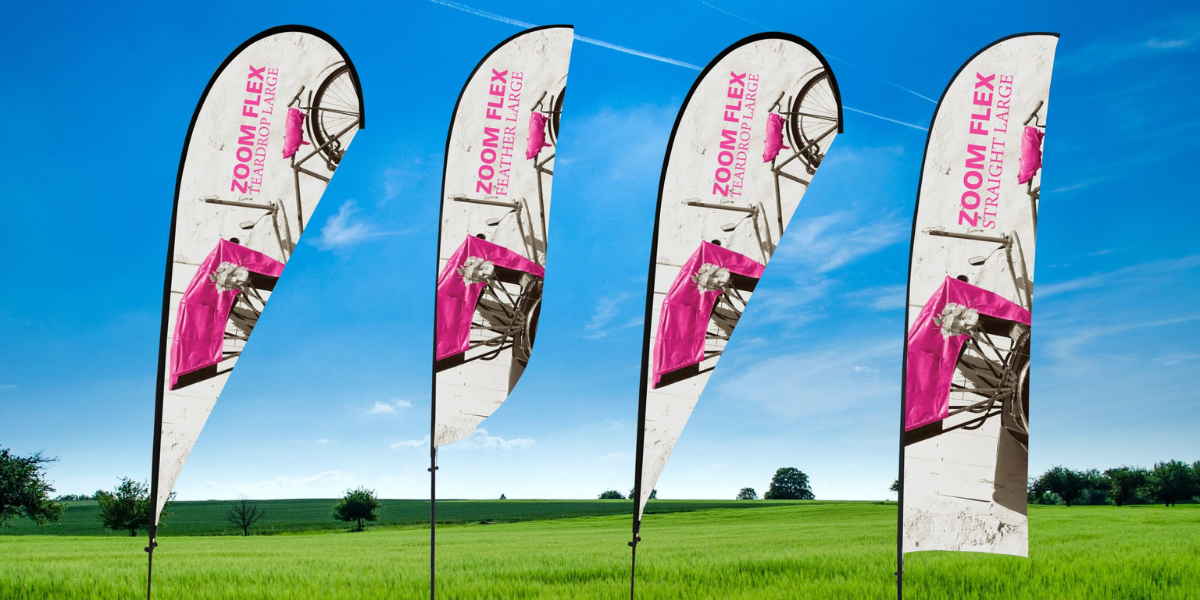
2. Modular, Reconfigurable Displays
Exhibitors are tired of buying a new booth for every show. Modular systems – components that snap together in different configurations – let you run a 10×10 at one event and a 20×20 at the next using the same kit.
Beyond saving money, modular displays travel lighter and set up faster. Swappable graphic panels mean you can refresh your messaging without replacing the whole structure. For brands that exhibit often, this flexibility is quickly becoming the default rather than a nice-to-have.
3. Sustainable and Eco-Friendly Materials
Sustainability has moved from marketing angle to genuine buyer expectation. Recyclable substrates, fabric graphics instead of vinyl, reusable hardware, and LED lighting all signal that a brand walks its talk.
Eco-conscious booths also tend to look cleaner and more modern, since the materials lend themselves to minimalist design. Attendees increasingly notice and reward this, especially in industries where environmental responsibility is part of the conversation. Choosing greener tradeshow graphics is good for the planet and good for your image.
4. LED Video Walls and Motion
Nothing stops foot traffic like movement. LED video walls and dynamic digital displays let you loop product demos, animations, and changing messages that static panels simply can’t match.
Motion catches the eye even in peripheral vision, which is exactly what you want on a busy floor. The technology has come down in price enough that mid-size booths can now afford it, and the same fundamentals that make LED signs work for businesses apply here. Even a single screen surrounded by strong print graphics can lift a booth from ordinary to magnetic.
5. Seamless Tension-Fabric Backwalls
Stretch-fabric displays have largely replaced rigid panels for a reason. They produce a smooth, seamless graphic surface with vivid, edge-to-edge color and no distracting seams or glare.
Fabric also packs down small, weighs little, and resists wrinkles, which makes shipping and setup painless. The result is a backwall that looks high-end and photographs beautifully – important when attendees are sharing your booth on social media. For most exhibitors, tension fabric now offers the best balance of quality, cost, and convenience.
6. Interactive and Touchscreen Elements
Booths are becoming experiences, and interactivity is the engine. Touchscreens for product configurators, gamified demos, lead-capture kiosks, and even simple QR-driven activations turn passive viewers into engaged participants.
The longer someone interacts with your booth, the more likely they are to remember your brand and leave their contact information. Interactive elements also create natural conversation starters for your sales team. Done well, they make the difference between a booth people glance at and one they actually spend time in. That dwell time is a core part of what makes tradeshow graphics attract booth visitors in the first place.
7. Biophilic Design and Natural Textures
A growing trend brings the outdoors in. Wood tones, greenery, natural textures, and warm, organic palettes create booths that feel calm and inviting amid the chaos of a convention center.
This look works because it stands out by being softer, not louder. In a hall full of harsh lighting and hard surfaces, a booth with natural warmth feels like a place to pause. Biophilic design is especially effective for wellness, food, lifestyle, and sustainability-focused brands, but its welcoming quality has broad appeal.
8. Full-Environment Branding With Floor Graphics
The best booths in 2026 don’t stop at the walls. Branded flooring, rugs, and printed floor graphics extend your identity across every surface, creating a fully immersive space that feels intentional from the ground up.
Floor graphics also do practical work: they can direct foot traffic, mark a path to your demo station, or simply make your booth footprint feel larger and more defined. If you’re new to this surface, here’s everything you need to know about floor graphics before you commit. Treating the floor as canvas is one of the easiest ways to look a step ahead of your neighbors.
9. Minimalist, White-Space-Forward Layouts
In reaction to years of cluttered booths, many brands are going the opposite direction with clean, spacious, gallery-like designs. Generous white space, a tight color palette, and a single clear focal point project sophistication.
Minimalism takes discipline – it means cutting most of what you’d instinctively include. But a calm, uncluttered booth signals a confident, premium brand and gives your key message room to land. This is where a partner like Element 4 Signs & Graphics earns its keep, helping you decide what to leave out so the essentials shine. Less, executed well, almost always beats more.
10. Bold Gradients and Retro-Futurist Color
Color is getting braver. Vibrant gradients, duotones, and retro-futurist palettes – think electric blues, warm corals, and unexpected pairings – are showing up on backwalls and digital screens everywhere.
These rich color treatments photograph well and feel current, which matters when attendees are deciding in a split second whether your brand looks modern. Used thoughtfully, a striking gradient becomes a recognizable signature. Strong, consistent color is also a quiet driver of memory, tying directly into how signage and brand recognition reinforce each other show after show.
Trends come and go, but the principle behind all ten stays the same: clarity, confidence, and a complete experience beat clutter every time. You don’t need to chase every look on this list. Pick the two or three that fit your brand and budget, execute them cleanly, and your booth will hold its own on any 2026 floor. Start planning early, and give your tradeshow graphics the runway they need to make a real impression.
FAQs
- How far in advance should I design my tradeshow graphics?
Aim to start six to eight weeks before the show, and earlier for large or custom builds. This leaves time for design revisions, printing, and a test setup before you ship. Rushing the process is where mistakes and rush fees creep in.
- What’s the most important element of a trade show booth?
A clear, readable headline that communicates what you do from across the aisle. Attendees give you only a couple of seconds, so the top priority is a message they can grasp instantly. Everything else – color, motion, interactivity – supports that core message.
- Are fabric or rigid graphics better for trade shows?
For most exhibitors, tension-fabric graphics win on cost, weight, and appearance. They pack down small, resist wrinkles, and produce seamless, vivid color. Rigid panels still have a place for specific high-end or structural applications, but fabric covers the majority of needs.
- Do I really need digital or interactive elements?
Not necessarily, but they help. Motion and interactivity increase dwell time and engagement, which leads to more leads and stronger recall. If budget is tight, even one screen or a simple interactive station can add meaningful impact alongside strong print graphics.
- How can I make a small booth stand out?
Lean into one bold idea rather than many. Strong typography, a single eye-catching color or graphic, smart lighting, and an uncluttered layout make a 10×10 feel intentional and premium. Floor graphics can also make a small footprint feel larger and more defined.
- How do I keep my booth on-brand across different shows?
Use a modular system with swappable graphics and a consistent color palette, logo treatment, and typography. This lets you adapt the size and message for each event while keeping your visual identity recognizable. Consistency across shows is what builds lasting brand recognition.
